Responsive design makes the website responsive so that it renders well on a variety of devices and screen sizes. It detects the visitor’s screen size and orientation and changes the layout accordingly.
One of the great strengths of digital media is its ability to display identical content in different ways with just a few instructions. In fact, if there are no formatting instructions at all for how to display text, the text of a web site will wrap according to the size of the display device. In other words, by default web sites are responsive. In recent years, however, sites have become more graphical and are designed for specific widths. This has caused some problems for mobile users.
The landscape is shifting, perhaps more quickly than we might like. The Internet isn’t just on your computer screen anymore. It’s also on your phone, your tablet, your laptop.
Mobile browsing is expected to outpace desktop-based access within three to five years. Responsive layouts are specifically designed to keep mobile devices in mind. Responsive Design aims to produce the optimal user experience for different use cases and environments, all built into one website. Responsive Design mostly relies on liquid design. This means it must be designed and constructed to adapt to the size of the device. Not all design concepts will translate effectively to the responsive architecture requirements.
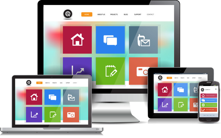
Responsive web design is a way of making a single web site that works effectively on both desktop browsers and the myriad of mobile devices on the market. Responsive architecture gives the best quality browsing experience – whether on a smartphone, tablet, netbook or e-reader, and regardless of the operating system.
People who browse while on-the-go have very different needs than those sitting at a desk. Responsive web sites re-organize themselves automatically according to the device viewing them, so that the same web site provides a great experience everywhere. Desktops get a full-blown interface with videos, large images and animations. Smartphones get a simplified web site that runs fast without the bells and whistles. Tablets and netbooks get something in between.
The web site automatically adjusts according to the device’s screen size and orientation. Large or small – landscape or portrait, responsive sites switch between these on the fly. The layout of a responsive web site can change to accommodate the device viewing it. If you want your current web site adapted to the responsive architecture requirements you may need to make significant design changes and this may result in a web site that looks different from the original.